A landing page is a web page designed specifically to drive users towards a particular action, such as purchasing a product or requesting information. To be effective, it requires an intuitive design, persuasive microcopy, and continuous data-driven optimisation.
Effective landing pages: from design to microcopy
Date
08 March 2024
In the digital realm, the landing page objectively plays a very delicate role: it’s the first point of contact between a brand and its target audience. This page is more than just a virtual business card; it’s a powerful marketing tool designed to convert visitors into customers, whether they are followers, participants in a certain event or activity, or subscribers to services or communications.
The importance of the landing page in digital marketing
In an ever-evolving digital world, the landing page element undeniably serves as the focal point around which the entire digital marketing strategy revolves. These specialised pages are designed with a single goal in mind: to drive the user towards a specific action. Whether it’s subscribing to a newsletter, making a purchase, or registering for a course, the success of a landing page is measured by its ability to convert visitors by prompting them to take concrete actions. This conversion ability not only directly impacts sales or sales or registration performance, but also affects the overall user experience with the brand. An optimised landing page guarantees that the first interaction with the company is positive, offering a smooth and intuitive path that leads the user from interest to action with minimal resistance.
How to create an effective landing page: key elements and best practices
Creating an effective landing page is based on a number of fundamental design and marketing principles. Every element, from layout to font choice, images to microcopy, must be meticulously considered and optimised to guide the user towards the desired action.
Let's explore each component of a landing page in detail:
- Layout and structure: a clean and intuitive layout is winning in most cases. Using a visual hierarchy, that directs the user’s eye to focal points, such as the key benefits of the product or service and the call-to-action (CTA), is essential to capturing and maintaining their attention.
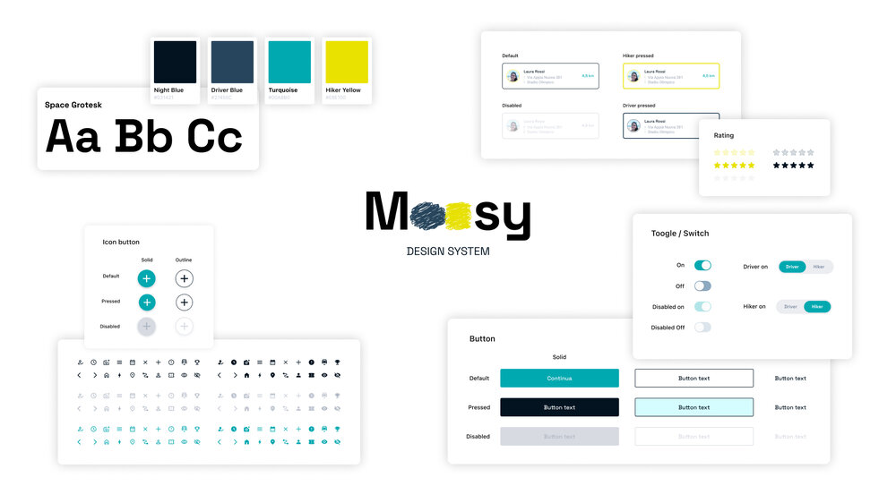
- Colours and fonts: colours can have a profound impact on users’ emotions and decisions. Choosing a palette that reflects the brand identity, and at the same time evokes the right emotional reactions, can significantly enhance the landing page’s effectiveness. Similarly, a readable font that aligns with the brand’s visual identity helps communicate messages more effectively.
- Images and videos: Visual elements must not only be aesthetically pleasing but also relevant and capable of immediately conveying the value of the product or service, or whatever it is the user is observing. A powerful image or video can do much to capture interest and keep visitors on the page longer.
The procedure for creating an effective landing page entails a comprehensive approach that touches upon various disciplines: best practices, aesthetics, functionality, and message clarity are taken into account throughout every stage of the design process in order to maximise conversions.
Microcopy: communicating effectively and persuasively
Microcopy, a strategic element of every landing page, acts as a bridge between the user and the action we want them to take. These text fragments – animating buttons, headings, sub-headings, and calls-to-action – hold enormous potential in defining conversion success. The art of UX copywriting takes centre stage: it’s not just about writing, but about carefully selecting every word to evoke response and action, maintaining impeccable clarity.
In addition to having a heightened linguistic sensibility, the professionals involved in this delicate phase of landing page design, whether experts in design, fashion, visual arts, or communication, must typically have a thorough understanding of the target audience and the context in which the message will be placed. The results? Microcopies that speak directly to the user's heart and mind, driving them towards conversion through an intuitive flow, in a completely natural manner.
Professionals involved in this delicate phase of landing page design, whether they are experts in design, fashion, visual arts, or communication, must possess not only a keen linguistic sensitivity but also a deep understanding of the target audience and the context in which the message will be inserted. The result? Microcopy that speaks directly to the user’s heart and mind, guiding them naturally and intuitively towards conversion.
Optimisation for conversion: a/b testing and data analysis
Landing page optimisation is a dynamic and never-ending process. Employing techniques such as A/B testing and data analysis is fundamental for discerning the most and least successful elements. Comparative testing of different versions of the same landing page allows one to accurately evaluate the effectiveness of specific changes in layout, microcopy, images, or any other page components.
This empirical method allows for refining communication strategies based on concrete data, maximising the page’s conversion potential. There is an increasing demand for digital marketing, design, and data analysis specialists on the job market, as they play a decisive role in this phase, applying their analytical skills to interpret the data collected and suggest effective improvements.
And regardless of whether we focus on honing the art of microcopy through UX copywriting, or optimising conversion rates through a/b testing and data analysis techniques, these combined efforts will ensure that each landing page not only resonates with the desired audience, but also effectively drives it toward the desired action, supporting strategic objectives.
How to structure effective landing pages
An effective landing page is a synergistic work involving analysis, creativity, and strategy. Imagine constructing an ideal landing page, a blueprint that reflects the industry best practices. The structure of this model page includes key elements, each designed to capture the attention, inform, and ultimately convert.
1. Heading and sub-heading: first impressions are crucial. The header should combine a title and a sub-title that together clarify the value of the product or service. A high-quality background image or a short video can amplify the message, creating an immediate emotional connection.
2. Value proposition: in a few incisive sentences, this segment explains what makes the offer unique and why the visitor should be interested.
3. Reviews: testimonials and case studies provide tangible proof of the value of the product or service. This “proof” increases the brand’s trustworthiness and credibility by highlighting the successes achieved by other users or customers.
4. Description of the product or service: this is the core of the page, detailing features, benefits, and any differentiators. The goal is to educate the visitor, providing all the necessary information to make an informed decision.
5. Visual elements: images, icons, graphs, and videos don't just serve decorative purposes, but are also functional for understanding the message. They should be relevant, high quality, and designed to break up the text to make reading less tiring and more pleasant.
6. Calls-to-Action: CTAs are among the most important elements of a landing page, as they represent the moment that the user is asked to perform a specific action. They should be visually distinct, with a message that clearly and urgently incites action. Placing calls-to-action at multiple points on the page can also increase the likelihood of conversion.
7. Simple and intuitive form: if the goal is to collect information or data, the form should be as concise as possible. Asking only for essential data reduces the time needed to complete it and increases the likelyhood that the user will fill it out.
8. Informative footer: although located at the bottom of the page, the footer plays quite a tactical role. It can include additional information, useful links, and contact details, providing a final resource for undecided users.
As we have seen in this article, creating a successful landing page requires specialised skills in various fields, such as design, copywriting, user experience, and analysis. This synergy of expertise highlights the importance of comprehensive, targeted, and in-depth training. If you are interested in exploring the fields of marketing and communication, creative professions, graphic design, and user experience, delve into these disciplines with IED. At your disposal are many high-quality educational paths, which you can filter by your city of interest, combining theory and practice in an avant-garde and job-oriented teaching approach.


